
 admin
admin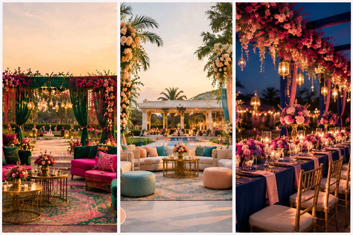
Your wedding colour palette will appear in almost every photograph, from the mandap and couple portraits to family pictures, decor details, and the evening reception. But choosing those colours is not simply about following the latest wedding trend. The better approach is to look at where the photographs will actually be taken. At Radhe Upavan, outdoor lawns surrounded by greenery create a very different photographic backdrop from an indoor banquet space. An afternoon ceremony also interacts with colour differently from an evening reception under artificial lighting. So, instead of asking which wedding colours are trending, ask a more useful question: which colours will look their best against your wedding venue and lighting?
Here are some wedding colour combinations that can work particularly well for different celebrations at Radhe Upavan.
Your dream colours deserve a backdrop that makes them stand out.
Why Your Wedding Venue Should Influence Your Colour Palette
A colour combination that looks beautiful on a mood board may not have the same impact when placed against your actual wedding backdrop. Outdoor lawns already bring plenty of green into your photographs. Very pale shades can sometimes lose definition against greenery and bright daylight, particularly in wide photographs. Richer colours can provide the contrast needed to make outfits, flowers and decor stand out. Indoor spaces create a different environment. Warmer artificial lighting can complement deeper reds, burgundy, gold, and other rich tones. Evening receptions offer another opportunity. Once daylight fades, darker colours can look more dramatic under decorative lighting. This is particularly important when choosing among outdoor wedding resorts in Ahmedabad. Your venue’s landscape should be part of the colour-planning process rather than something considered after the decor is finalised.
Best Colour Combinations for an Outdoor Wedding
1. Emerald Green and Fuchsia
Emerald and fuchsia make a vibrant jewel-toned combination for an outdoor ceremony.
Although green may seem like an unusual choice against a green lawn, a rich emerald has considerably more depth than the surrounding foliage.
Fuchsia then introduces a contrasting colour that can immediately draw attention in photographs. Use fuchsia through flowers, bridalwear, bridesmaid outfits, or mandap details, while emerald can appear through fabrics and accent decor.
2. Deep Blue and Pink
For a more contemporary palette, pair deep blue with pink.
Royal blue, indigo, or another saturated blue can create strong contrast against greenery, while pink adds warmth and softness. The combination can work across outfits, floral arrangements, seating details, and mandap decor.
The deeper blue also acts as a visual anchor, preventing the palette from becoming overly bright.
3. Deep Teal and Peach
If you prefer something softer, deep teal and peach can offer a balanced alternative. The teal provides enough contrast for outdoor photographs, while peach adds warmth without overpowering the setting. This combination works particularly well for couples looking for a modern palette that is colourful without being excessively vibrant.
Choose the setting where every colour, detail, and photograph comes together beautifully.
Plan Your Wedding at Radhe Upavan
Are Pastel Colours a Good Choice for Outdoor Weddings?
Pastels can certainly work outdoors, but they need to be balanced carefully. Powder pink, pale peach, ivory, mint, and light lavender may look beautiful in close-up photographs, but bright daylight and greenery can sometimes make extremely pale shades appear less defined.
The solution is not to avoid pastels altogether. Instead, combine them with a broader accent:
- Blush + Burgundy
- Peach + Emerald
- Lavender + Plum
- Powder Blue + Navy
This keeps the romantic quality of pastels while giving your photographs enough contrast.
Richer Colours for Indoor Banquet Weddings
Indoor wedding spaces offer greater control over lighting and decor, which can make richer colour palettes particularly effective. For couples exploring luxury wedding venues in Ahmedabad, combinations such as deep red and gold can create a warm, traditional appearance.
1. Deep Red and Gold
Maroon, crimson, or deep red paired with gold works naturally with traditional Indian wedding styling. Gold accents can appear through bridal embroidery, mandap details, stage decor, table settings, and decorative elements. Under warmer indoor lighting, the combination can create photographs with a rich and festive appearance.
2. Burgundy and Champagne
For something more contemporary, consider burgundy with champagne. The deep burgundy provides visual depth, while champagne adds softness without making the palette too bright. It can work particularly well for indoor decor, bridalwear, and reception styling.
The right backdrop can change your entire wedding album. See what yours could look like.
Wedding Colour Combinations for an Evening Reception
A reception does not need to follow the same colour palette as your daytime ceremony. Once the sun goes down, artificial lighting becomes part of the photographic environment. This allows you to introduce darker and more dramatic colours that may feel too heavy under bright daylight.
1. Wine and Gold
Wine, burgundy, or deep plum paired with gold can create a sophisticated reception palette. The darker base adds depth, while gold details can catch decorative lighting and add visual interest to stage decor, outfits, and photographs.
2. Navy and Champagne
Navy and champagne offer a refined alternative for a contemporary evening reception. Navy creates a strong visual anchor, while champagne introduces a lighter element. The combination can work across the groom’s outfit, bridesmaid dresses, stage decor and table details.
3. Emerald and Rose Gold
Emerald can take on a more dramatic character under evening lighting. Pairing it with rose gold adds warmth and creates a modern, glamorous combination without relying on too many colours.
Wedding Colour Combinations by Setting
Wedding setting | Colours to consider | Why they work |
Outdoor lawn ceremony | Emerald + Fuchsia | Creates contrast against greenery |
Daytime celebration | Deep Blue + Pink | Rich shades remain visible in bright light |
Soft outdoor decor | Teal + Peach | Balances contrast with warmth |
Indoor banquet | Deep Red + Gold | Complements warmer lighting |
Contemporary indoor wedding | Burgundy + Champagne | Rich but balanced |
Evening reception | Wine + Gold | Adds depth under artificial lighting |
Modern reception | Navy + Champagne | Creates a refined contrast |
How to Choose Colours That Photograph Well
Before finalising your wedding palette, look beyond colour swatches.
- Check the backdrop: Consider the greenery, walls, flooring, stage and existing decor that will appear behind you.
- Consider the time of day: Colours can look significantly different in afternoon sunlight and evening lighting.
- Create contrast: Your outfit should not disappear into the decor. Use broader accents against lighter backgrounds and lighter details against darker settings.
- Limit dominant colours: Two or three main shades are usually easier to coordinate than a large collection of competing colours.
- Think about the entire album: Your palette will appear across portraits, candid photographs, group pictures and decor shots. It should work consistently across all of them.
From vibrant lawn ceremonies to glamorous evening receptions, find the space that fits your vision.
Should Every Wedding Function Use the Same Colours?
Not necessarily. Keeping a common colour story can make your celebrations feel connected, but each function can have its own palette based on the space and time of day.
For example:
- Day Ceremony: Emerald + Fuchsia
- Mehendi: Yellow + Pink
- Indoor Wedding: Deep Red + Gold
- Evening Reception: Navy + Champagne
This gives every celebration its own visual identity while keeping the overall wedding cohesive. For couples comparing wedding resorts in Ahmedabad, this flexibility can be especially useful when planning multiple functions across different spaces.
Frequently Asked Questions
1. Which colours look best against a green outdoor wedding backdrop?
Fuchsia, deep blue, burgundy, plum, and other jewel tones can provide strong contrast against greenery. Pastels can also work when paired with a broader accent.
2. Are pastel colours suitable for outdoor weddings?
Yes, but very pale pastels may have less definition in bright daylight. Pairing them with a deeper shade can create better contrast.
3. Which colours work best for an indoor wedding?
Deep red, burgundy, gold and champagne can complement warmer indoor lighting and create a richer appearance in photographs.
4. What colours are suitable for an evening reception?
Wine, navy, emerald and plum can work particularly well under evening lighting, especially when paired with gold, champagne or rose gold.
5. Choose Colours for Your Venue, Not Just the Trend
The most photogenic wedding colour combination is not necessarily the one dominating this season’s mood boards. It is the one that works with your venue, backdrop, lighting, and photography style.
Wrapping Up
At Radhe Upavan, outdoor greenery, indoor banquet spaces, and evening celebrations offer different visual environments. Use that variety to your advantage and choose colours according to where each celebration will actually take place. Whether you’re exploring outdoor wedding resorts in Ahmedabad, luxury wedding venues in Ahmedabad, a big banquet hall for a wedding in Ahmedabad, or the best resorts for wedding reception in Ahmedabad, start with the setting. Because when your colours work with the venue instead of competing with it, your wedding photographs can look more balanced, vibrant, and timeless.
Plan Your Celebration at Radhe Upavan